What Shopify Fashion Themes Reward From Your Product Photos Before You Pick a Theme
Before you switch Shopify fashion themes, audit whether your product photos can support galleries, rollover, zoom, and lookbook layouts.
A premium Shopify theme can make a fashion store feel more polished, more editorial, and easier to shop. But a theme upgrade often exposes something merchants only notice once the redesign starts: the theme is only as strong as the product imagery inside it.
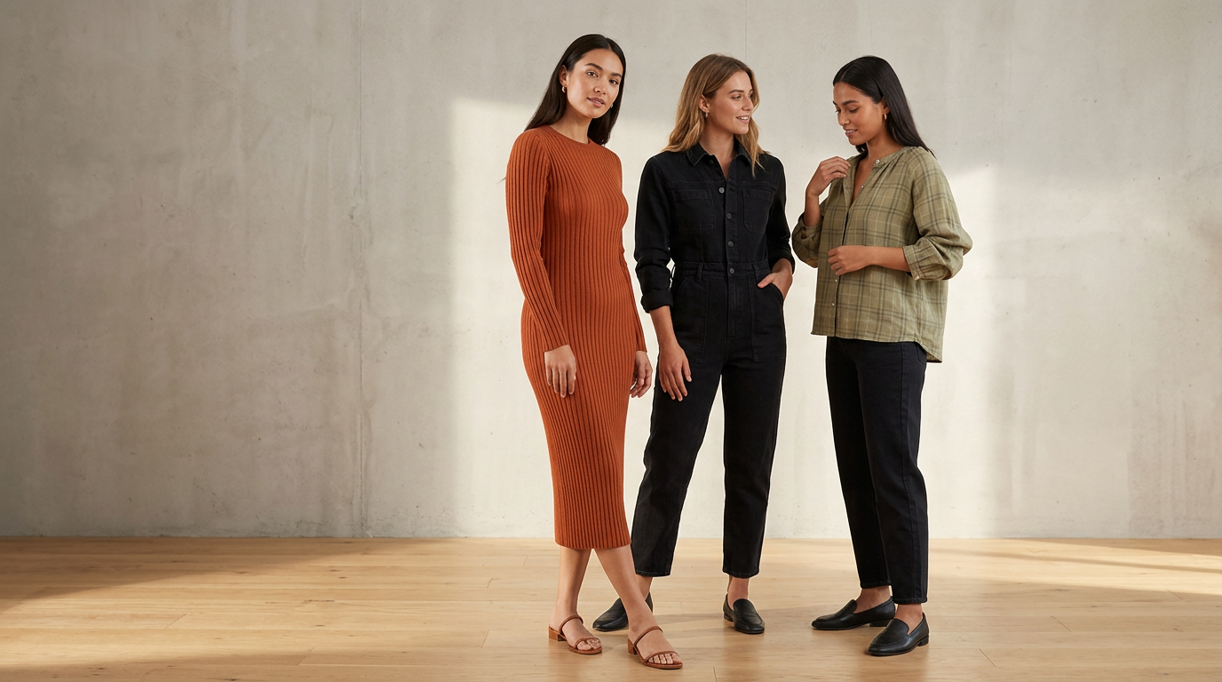 Cohesive on-model imagery gives a premium theme stronger merchandising material to work with.
If your new theme leans on large galleries, image rollover, zoom, lookbooks, and quick view, average product photos can start to feel much weaker. In fashion, that usually shows up as flat product shots with no body context, inconsistent crops, mixed lighting, or galleries that do not add much beyond the first image.
Before you choose a new theme, it helps to plan your product imagery around the merchandising features that theme will actually use.
On Shopify's Tinker theme page, the listed merchandising features include high-resolution images, image galleries, image rollover, image zoom, lookbooks, product videos, slideshows, and color swatches. Those are not minor design details. They change what your product pages need from photography.
This guide focuses on what image-led Shopify themes with Tinker-like merchandising features tend to reward, where fashion merchants get stuck, and how to audit your catalog before committing to a redesign.
Why theme selection and image planning should happen together
Fashion themes increasingly sell through visuals first. That does not mean every brand needs a huge editorial shoot. It does mean the theme may expect your images to do more than simply document the garment.
As VTN notes in its guide for fashion brands, Shopify is commonly used for premium, mobile-friendly fashion storefronts with strong imagery, custom layouts, and added merchandising features. In practice, that changes the job of your PDP image set.
Instead of one acceptable front-facing product photo and a couple of backups, an image-led theme may work best when you have:
- a strong first image that can carry collection pages and featured product cards
- useful alternate images for gallery browsing
- intentional image pairs for rollover states
- enough clarity for zoom behavior
- cohesive visuals for lookbook or editorial sections
- consistent crops across products and variants
If you skip this planning step, the redesign can create a frustrating result: the site looks more premium structurally, but the merchandise still looks uneven because the visual standard has gone up.
The Shopify theme features that raise the bar for apparel photography
Using Tinker as a concrete example, here are the theme features that should shape your image brief before you install anything.
High-resolution images
Themes that support high-resolution images make visual flaws easier to spot. Soft focus, rough cutouts, low-detail fabric shots, or inconsistent lighting become much more noticeable on larger screens.
For apparel, that matters when shoppers want to inspect:
- fabric texture
- seams and finishing
- drape
- print detail
- embellishments
- fit cues around shoulders, waist, hem, and sleeve
Image galleries
A gallery-based PDP works best when each image answers a different shopper question.
The sources here support the importance of galleries and alternate images, but they do not define one universal six-image fashion standard. So rather than treat this as a rule, treat it as a planning prompt: for each product, ask whether your gallery shows the product clearly, reveals a second useful angle, surfaces an important detail, and gives enough context for fit or styling when needed.
If every gallery image is basically the same crop on the same background, the feature exists, but the shopper learns very little.
Image rollover
Image rollover on collection pages can be especially useful in fashion because it lets shoppers compare two states quickly without opening the PDP.
But rollover only works when image one and image two are intentionally paired.
Helpful rollover pairs often include:
- flat-lay to on-model
- front view to back view
- still pose to alternate pose
- neutral studio view to styled view
Weak rollover pairs usually happen when the second image is cropped differently, lit differently, or does not reveal anything new.
Image zoom
Zoom features matter when garments have texture, tailoring, trims, ribbing, lace, buttons, hardware, or prints that affect purchase confidence.
If your source files are too soft or too small, zoom creates a poor experience quickly. The shopper tries to inspect the garment and gets blur instead of reassurance.
Lookbooks and editorial sections
Lookbooks are where many brands discover they have a theme problem that is really an image planning problem.
A theme can offer a beautiful editorial section, but it still needs imagery with:
- consistent direction
- cohesive styling
- aligned aspect ratios
- flexible composition for layout crops
- visual continuity across a collection
For many apparel brands, this is the point where flat-only catalogs start to feel limiting. If shoppers need help understanding silhouette, proportion, or styling, on-model imagery often gives those sections more useful visual depth.
A practical PDP image plan before a theme refresh
Not every store needs a full editorial production for every SKU. And the approved sources do not establish a single required apparel image framework.
So instead of treating the list below as an industry standard, use it as a practical planning heuristic for fashion merchants evaluating whether their current catalog can support a more image-led Shopify theme.
1. Start with a strong hero image
Your first image may appear on:
- collection grids
- search results
- featured product modules
- quick view
- recommendation blocks
- the PDP itself
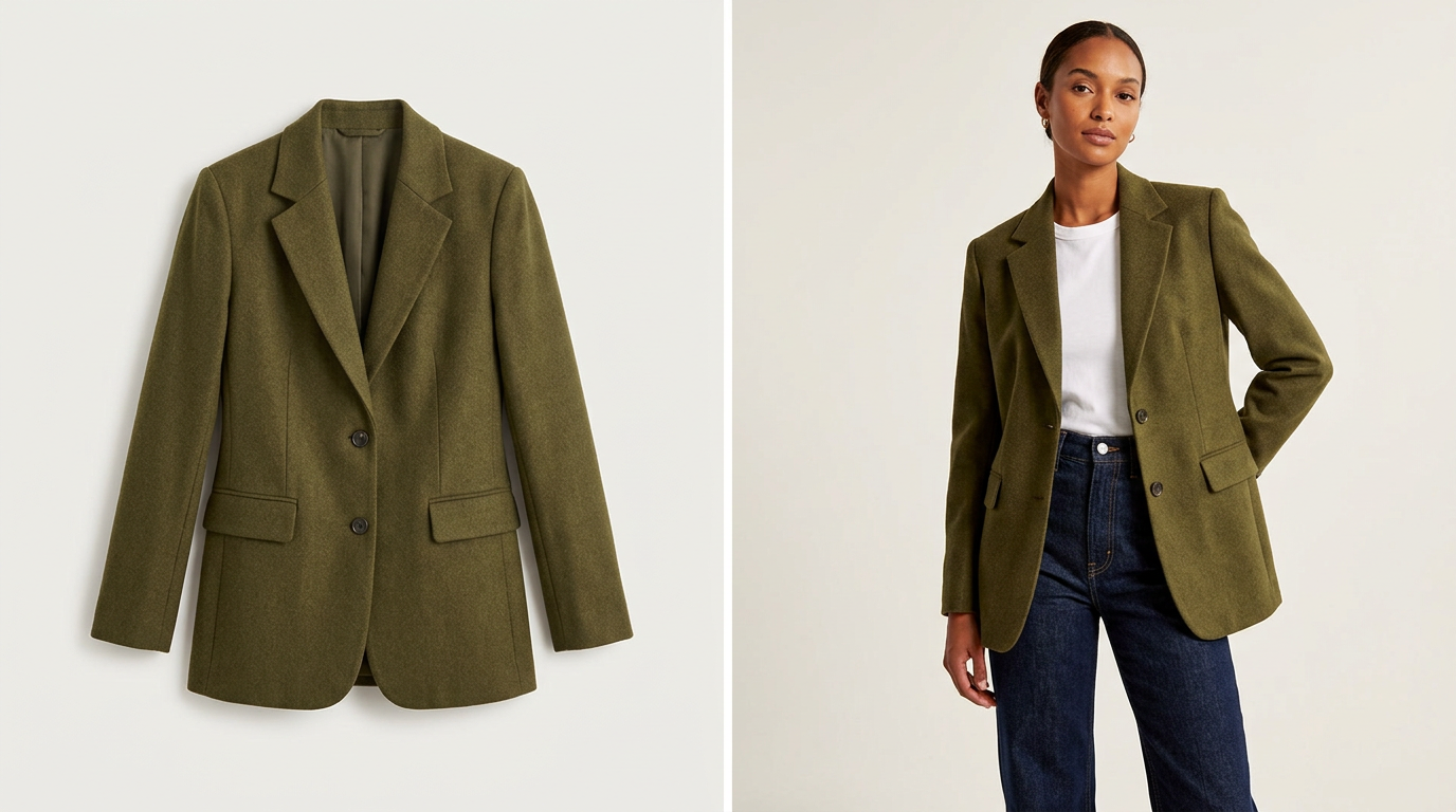
That first frame has to do a lot of work. For products where silhouette and fit matter, many merchants find that an on-model hero communicates more than a flat-lay alone.
2. Add one alternate angle that earns its place
Your second image should add information, not just variation. That could be a back view, side view, or alternate pose that shows shape, drape, or construction more clearly.
3. Include at least one detail that answers a real question
If material, trim, knit, or finish affects the buying decision, a closer image can do more than extra copy ever will.
4. Decide where body context is actually necessary
Not every product needs the same treatment. But dresses, outerwear, tailoring, denim, and fit-sensitive tops often benefit from an image that shows how the garment sits on a body.
5. Make your variant approach consistent
If you sell multiple colors or prints, your image plan should stay coherent across variants. Otherwise swatches, galleries, and collection cards can feel uneven in a more visual theme.
If your team is still deciding what a repeatable image system should look like, start with the guide to keeping model photos consistent across Shopify product pages.
The common mismatch: premium theme, thin image set
A lot of merchants assume the theme alone will make the storefront feel premium. Usually, what happens is the theme reveals the limits of the current image library.
Across the sources and common merchant workflows, the same pain points keep showing up:
- inconsistent lighting across SKUs
- mixed aspect ratios
- flat-lays that do not show fit
- missing alternate angles
- no close-up details
- weak gallery depth
- collection cards that all look the same
- hero sections that call for stronger editorial imagery than the catalog currently has
The AIMS article makes part of this problem very clear: Shopify makes it easy to launch a store, but it does not automatically make product photos good. It also calls out issues like inconsistent lighting, busy backgrounds, and wrong aspect ratios.
You do not need to rely on every vendor claim in that article to recognize the workflow problem. Many merchants upgrade storefront design before they upgrade the visual inputs the design depends on.
How to audit your catalog before choosing a Shopify fashion theme
Before paying for theme setup, run a quick image audit on 10 to 20 representative products.
Score each product against the following questions.
Can your first image carry a collection page?
Look at your category grid as if a shopper only sees one image per product. Ask:
- Is the silhouette obvious?
- Does the image feel on-brand?
- Is the crop consistent with the rest of the catalog?
- Would this still look strong in a larger-card, image-led theme?
Do you have a meaningful second image?
If the theme supports image rollover, is image two actually useful, or is it just another version of the same frame?
Do shoppers get enough fit context?
Can someone understand where the garment falls, how it sits, and what kind of shape it creates? If not, your PDP may be doing too much explanatory work in text.
Do you have enough resolution for zoom and reuse?
Can the file support zoom, cropping, homepage merchandising, and channel reuse without visibly degrading?
Do your galleries answer objections?
For each product, ask what a customer might hesitate about:
- Is it sheer?
- Is it oversized?
- How long is it?
- Is the knit chunky or fine?
- Does the fabric hold structure or drape softly?
Then check whether your images answer those questions.
Are your images consistent across the collection?
Theme demos look polished because the visuals are coherent. If your product pages mix white-background flats, dark lifestyle crops, loose UGC, and inconsistent model styling with no system, the final storefront can feel fragmented even with a strong theme.
When on-model visuals matter most
On-model imagery is not mandatory for every fashion brand. But it becomes more useful when your chosen theme leans heavily on visual merchandising.
It usually matters more when:
- your products rely on silhouette or fit to sell
- your collection pages use large image cards
- your theme uses rollover heavily
- your PDP depends on galleries rather than long-form education
- your homepage uses editorial blocks or lookbooks
- your launches need reusable creative across PDP, email, ads, and social
Claid's overview of on-model tools reflects the broader workflow shift: fashion brands increasingly want ways to turn flat-lays or mannequin shots into on-model visuals with fewer export-heavy steps, especially when they are working close to the Shopify catalog workflow.
For indie and growth-stage brands, this is often less about replacing every kind of photography and more about covering missing parts of the visual system.
Where flat-lay-to-on-model workflows can help
 Pairing flat-lay and on-model views can make fit-sensitive products easier to evaluate.
For many fashion teams, the bottleneck is not knowing what images they need. It is producing enough usable visuals quickly enough for launches, refreshes, and merchandising calendars.
That is where a flat-lay-to-on-model workflow can be useful for selected products. Instead of treating it as a blanket replacement for all photography, it can help fill specific gaps in a fashion catalog:
- adding body context to flat product pages
- creating stronger rollover pairs
- improving hero images for fit-sensitive products
- building more useful launch assets
- giving lookbook-style sections more wearable imagery
TinyLemon fits into that narrower workflow. It is built for Shopify fashion brands that want polished on-model product photos from flat-lay images, especially when they need stronger PDP visuals without organizing a traditional shoot for every update.
If you are planning a theme refresh, a sensible founder-style test is to try this on a few hero SKUs first and review the results inside your intended storefront layout. That is not a proven industry readiness formula. It is simply a practical way to see whether stronger on-model coverage would improve how your products appear in galleries, rollover states, and more editorial sections.
If your source images are mostly flat-lays, this walkthrough on turning flat-lays into studio-style Shopify photos is a useful next step.
Choose your theme after you understand your image system
A good fashion theme can absolutely improve merchandising. But it cannot invent a coherent PDP image strategy for you.
Before you pick the theme, ask a simpler question: do your product photos match the way that theme wants to sell?
If the answer is no, solve that first.
Your redesign will go more smoothly, and you will have a much clearer sense of whether the new storefront is being supported by the right imagery instead of exposing weak spots in the catalog.
Planning a theme refresh? Try rebuilding the image set for a few hero products first and see whether your storefront needs stronger body-context or on-model visuals before you commit to a full redesign. For more ideas, browse more Shopify fashion visual workflow guides.
Frequently asked questions
Why do Shopify fashion themes make product photo quality more important?
Because image-led themes often highlight merchandising features like high-resolution galleries, image rollover, zoom, and lookbook-style sections. Those features make weak crops, inconsistent lighting, and missing alternate views much more noticeable.
What images should I review before a Shopify theme refresh?
Start with your first image, second image, one detail view, and any image that helps explain fit or styling. Treat that as a planning heuristic, not a universal rule, then adjust by product type and how your theme uses images.
Is on-model photography required for a Shopify fashion store?
No. But it becomes more useful when products depend on silhouette and fit, collection cards are image-heavy, or your theme includes rollover and editorial sections.
How can I tell if my catalog is ready for a more image-led Shopify theme?
Audit 10 to 20 representative products. Check whether the first image is strong enough for collection cards, whether the second image adds new information, whether your files hold up for zoom, and whether the gallery answers common shopper questions.